
When we create a blog, we often have a fixed idea, only one: increase the traffic. This is to forget that the performance of a blog is not only based on the volume of traffic but also and especially on the conversion rate. Imagine a ready-to-wear shop visited by 10,000 people but generating only 3 sales per day. Is this shop performing? The answer is obvious.
As a blogger, your goal is to make sure that the maximum number of people who visit your blog do what you want them to do: sign up for the newsletter, sign up for a trial period, buy products, register for an event … How to achieve it?
Improve the positioning of links/buttons in your articles
The links and buttons on your pages are the elements that allow a visitor to become a customer, subscriber, registered … It is by optimizing the position, the text, the shape, the color, the size of these CTAs (call-to-actions, in French “calls to action”) that you will manage to improve the conversion rate of your blog. Even if it is not the only factor that impacts conversion: if your blog offers poor content or your offer has no interest, you may have beautiful buttons, well positioned, the conversion on your blog will be bad.
In this first part, we will focus on a particular aspect, but very sensitive: the position of links and buttons on your pages, in your articles. And beyond the position will be asked the form of your CTA: sidebar? pop-up? floating banners? etc. The positioning and shape of ACTs are more important than their wording.
Here, schematically, what is the structure of a blog like?
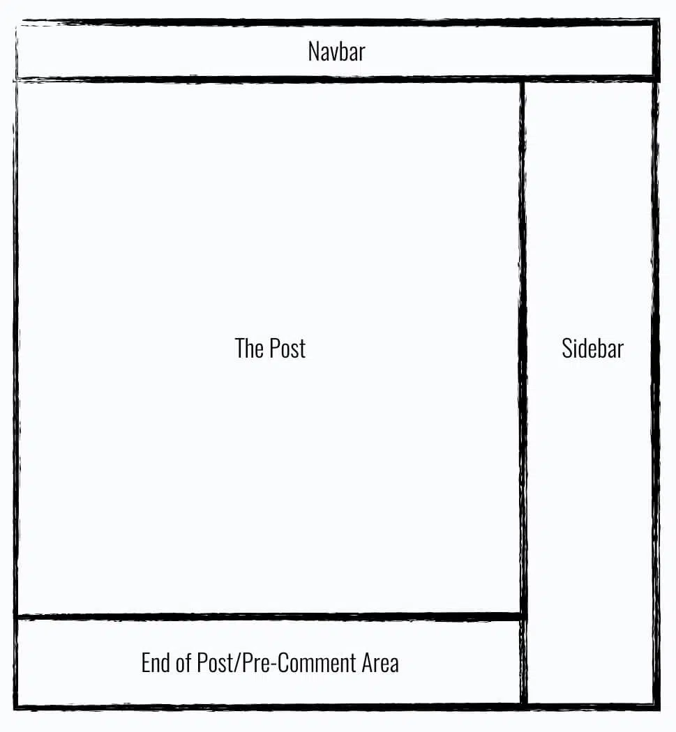
There are four main areas:
- The central zone, where the text of the article fits.
- Sidebar (or “sidebar” in French) on the right.
- A navigation bar at the top of the page, which can be floating or not.
- An area at the very bottom of the article, which precedes the space dedicated to comments.
The question we will try to answer is very simple: where to put CTA links and buttons? Which area to focus on? Which format of CTA to choose according to the zone of positioning? We will successively address several positions/formats of CTA possible. Let’s start with the sidebar.
# 1 The sidebar
The sidebar is the area preferred by most sites for positioning CTAs. We’ve all seen invitations to sign up for the newsletter in this area of the page. You may be even seen one to the right of the article you are currently reading! Is this really the best place to position your CTAs? It is estimated that the conversion rate of an invitation to subscribe to an email list positioned in the right sidebar is usually between 0.5% and 1.5%.
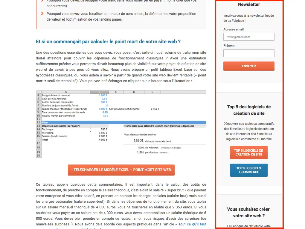
This means that if you have a monthly traffic of 100,000 unique visitors, you can expect to collect between 500 and 1,500 email addresses per month. To improve CTA conversion, we recommend limiting the number of widgets placed in the sidebar (above and below the CTA). These widgets tend to dilute the visitor’s attention, and thus to hinder the conversion. The Videofruit site managed to obtain a conversion rate of 1.64% on its CTA by removing all the surrounding widgets.
If you have substantial traffic (more than 50,000 unique visitors per month), we encourage you to do A / B Tests to find the best configuration of your sidebar. Note that some blogs simply choose to delete the sidebar and choose to position their CTA in other areas.
# 2 CTAs at the end of articles
The area at the end of the items is often considered the best place to position a CTA. The reasoning is simple: the visitors who see this CTA are those who have read the whole article (at least diagonally). They are committed visitors, who want more. Except that in fact, the conversion rate of ACTs positioned at the end of the article is identical to that of the ACTs integrated into the sidebar. Between 0.5% and 1.5%. In a sense, it makes sense: a certain/large number of readers do not read articles until the end – and therefore have no chance to click on the end-of-article CTA. This is why it is very relevant to position CTA not only at the bottom of the article but also at the top. Tests have shown that this makes it possible to multiply the conversion rate by 3.
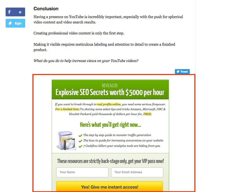
There is a tendency to ask the readers too much at the end of the articles. They are invited to subscribe to the newsletter, to share the article on social networks, to leave a comment, to register for the next webinar, etc., etc. This becomes unmanageable and sometimes unreadable for your visitors. We recommend that you minimize the number of requests to improve the conversion of ACTs.
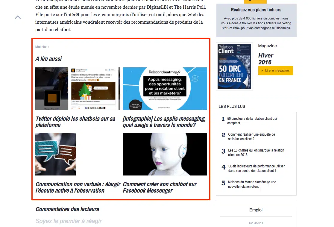
In absolute terms, we advise you to integrate only one CTA at the end of your articles. For example, a link to your store, to the homepage or to the page detailing the features of your tool/application.
# 3 The pop-ups
Pop-ups have bad press. They would be too intrusive, annoy Internet users. Yet, all studies show that pop-ups work, that they convert well – sometimes very well. Here is an example of a pop-up ( MyFeelBack ):

The pop-up format is suitable for all types of CTA: invitation to subscribe to the newsletter, to subscribe, to download an e-book, to buy a product, etc. In any case, we recommend that you do not ask for personal information (name, surname, email, etc.) as part of the pop-up. This information will be requested on the landing page on which people will click to click on the CTA of the pop-up.
The conversion rate of pop-ups is very variable, ranging between 1% and 8%. Yes, you read correctly: 8%. The conversion potential of pop-ups is pretty impressive. When a pop-up converts to 5% -6%, the presence of a sidebar becomes almost useless …
# 4 Banners / sliders
Banners can be placed at the very bottom or at the top of the page. They can remain on the screen when scrolling the page (we speak of floating banners):

Some sliders appear at the bottom right or bottom left of the page, most of the time after scrolling the page):
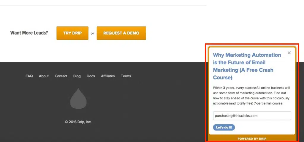
The conversion rate of banners/sliders is generally lower than that of pop-ups. But if your banner is big enough and engaging, you can expect a conversion rate very close to that of pop-ups. In general, the floating banner + exit pop-up combination (pop-up displayed when the user is about to leave the page) works quite well. But avoid overloading your pages in CTA, as this may degrade the reading experience of the article.
Note: Banners, especially those that appear at the bottom of the page, are particularly well suited for the mobile. Unlike pop-ups, which are very unpleasant on this type of devices (smartphones and tablets). In the example below, the banner remains displayed at the bottom of the screen without disturbing the reading of the article:

# 5 Welcome portals
Welcome portals are often considered aggressive, even more, aggressive than pop-ups. Yet, their conversion rate is often phenomenal. As a reminder, a welcome portal is a kind of huge popup that appears on arrival on the site. Here is an example ( eofire ):

The visitor who lands on a portal of welcome has two possibilities: to leave the portal to reach the site, or to answer the request (in general: to give his email address to subscribe to the newsletter). This format is intrusive. The visitor may feel trapped. Hence the importance of clearly displaying the exit routes (cross on the top right or top left, button “Go directly to the site” …). But if we mention this format, it is because of the impressive conversion scores it can get. Some welcome portals have a conversion rate of around 20% or more.

Comments are closed.